


Many people struggle with selecting the colors best suited for their modern reception area. That’s because there are so many to choose from, and many don’t understand the benefits and distractions of color. I believe getting clear about the purpose behind your selection is the first step in getting it right. Every business has something crucial it needs to communicate to its audience. Color is a great source for bringing that communication to the forefront. Getting in touch with the true definition of communication should be the primary consideration driving your reception-area color selection. Color functions as an unspoken language generating feelings, moods, and messages. Planning these things in advance, rather than approaching them randomly, represents a better approach to effective design communication.
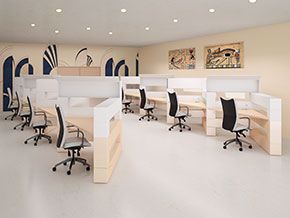
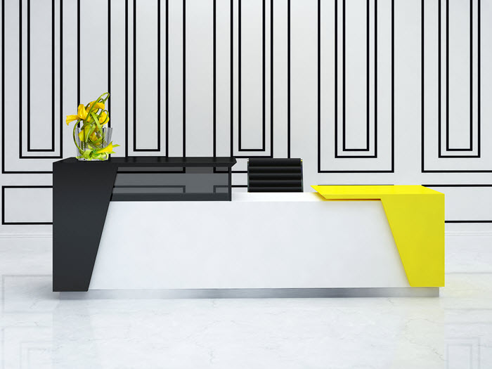
Your reception area is generally the first physical experience your audience will have with your company. The decision about which shade to set the perfect mood for your company is in your hands. According to experts, color is one of the best ways to connect with emotion. Color is a nonverbal design tool you can use to subconsciously affect how visitors feel while they are in your space. “As designers, we have the ability to create a space and feeling with [the colors we choose],” Say Dawn Stafford, founder of Gathering Souls, a Washington, D.C. interior design and event-planning company. While wall color represents a big part of your palette in your reception area, walls are not the only place we can use color to communicate. Modern reception desks, accent pieces, and artwork are all places to effectively utilize color. The ability to communicate your business without words should be at the forefront of your design planning.
Colors remind us of things. It triggers memories and feelings by association. Color is part of the common metaphoric language we use as to express feelings. Term like golden, green with envy, royal blue, or red hot all have us accessing specific feelings with emotional connections.
Think about the things and feelings we associate with red: stop, danger, heat, passion, and excitement.
Conversely, blue can mean cool, icy, calm, or comforting.
When we think of green, what generally comes to mind is go in a direction, growth, earth, money, health, and trust.
When yellow comes to mind, we generally think of bright, sunny, cheery, or happiness—something striking that grabs attention.
Pink, on the other hand, is strongly representative of the feminine gender. Men often associate it with being girly, prissy, or unmanly.
Black is often thought of as darkness, strength, and night life. When mixed with white, it can be striking—yin and yang.
When planning your modern reception-area color theme, don’t overlook the color of your ceiling, molding, and trim. These colors can change the entire look of your reception area.
The idea behind creating a communicative business environment in your modern reception space is to employ ideas, images, and associations that communicate via the senses—i.e., what we offer in the way of sound, smell, taste, and visual design. Strategically employing color in your reception-area walls, desk, flooring, and ceiling helps you design your space to dramatically impact the moods of your guests.