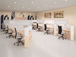
Given the cost of real estate, few companies can afford to occupy more space than they really need. In fact, many companies are making do with smaller spaces than they would like. For those companies, the question is: how do you take small reception areas, conference rooms, and private executive workspaces and make them work functionally without having them appear small and crowded? Here are a few office design ideas that may help to open up your space.
Reception Area and Conference Room Built-Ins
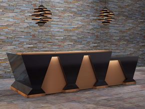
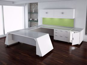
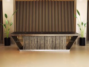
Built-ins are a way to make small modern reception areas, conference rooms, and even executive offices appear larger. You may also think about benches or seating that can be stored under a table. A custom reception desk with built-in storage, together with wall shelving or overheads with closed doors, can get things off the floor or stored away. Limiting the number of pieces of furniture occupying floor space will make your office feel more open and spacious.
Using Colors That Work for Your Workspace
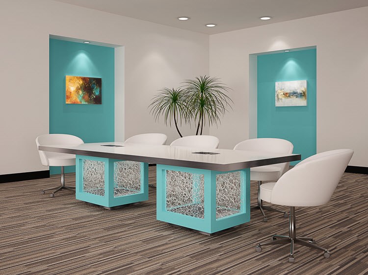
Don’t listen to rules that tell you not to use anything but neutrals in your small workspace. The important thing to remember when using bright hues is to restrict yourself to one per office, and only work with them sparingly. An accent wall, moldings, or bright accent pieces can add excitement to a small workspace without overpowering your office.
Designing Your Modern Reception Area with Basics Only
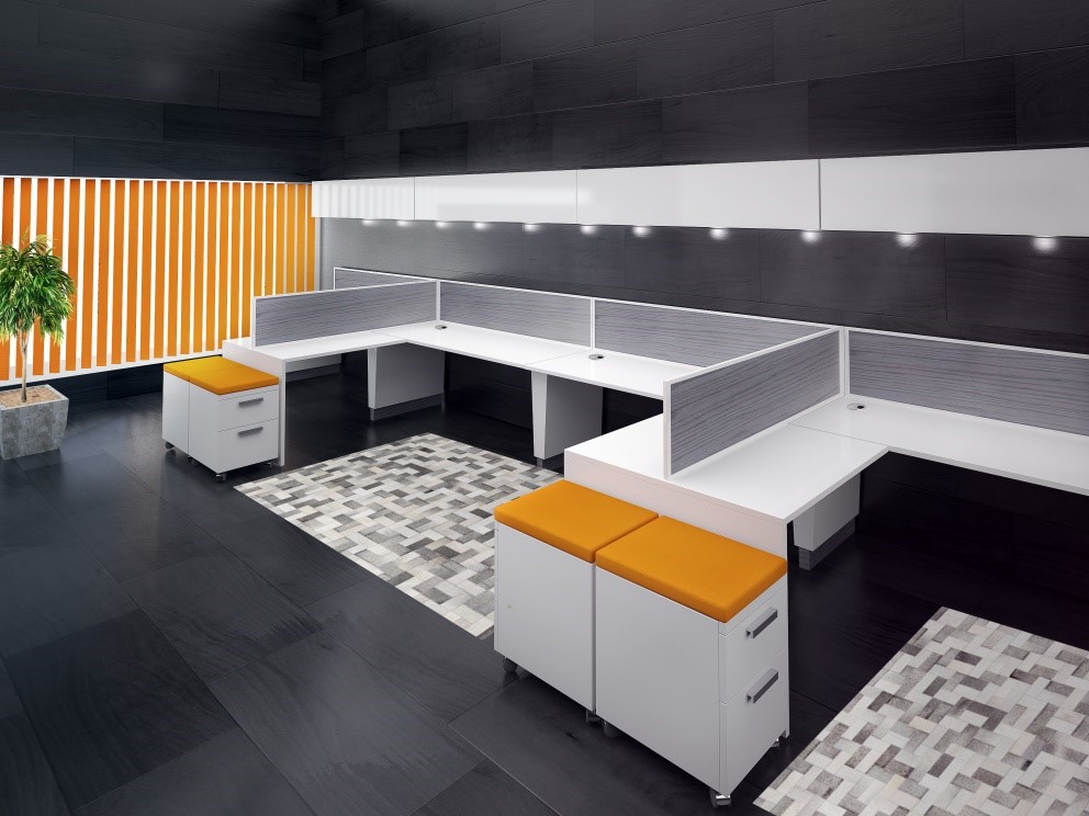
When you’re short of office space, you need to be merciless about keeping things basic. To keep your reception area as far as possible from claustrophobia, work only with the pieces you need for functionality, and add a few pieces you really like as accents. Think about investing in good-looking custom storage pieces to conceal stuff you need that might be viewed as clutter. Hide unattractive necessities (files, samples, and printers), and work with your receptionist to put away things that are not in use.
Limit the Use of Patterns
In a small office, too many patterns—or even excessive use of the same pattern—can be too much to handle visually. For example, putting patterns on walls and the floor—or even on window treatments—may come across as over-the-top to look at on a regular basis. You may want to use mainly solid colors and throw in a pattern for a little visual excitement.
Get the Outdoors into Your Conference Room and Reception Area
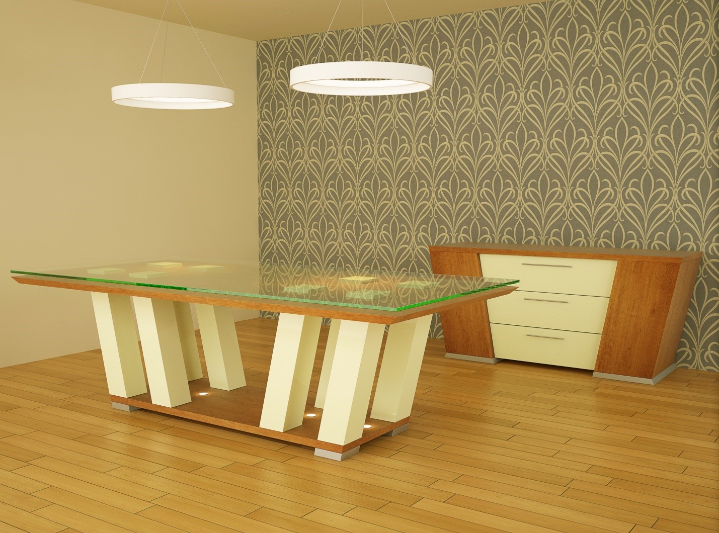
Let in the great outdoors. If your modern conference room is limited regarding space and you have windows, let the treatments you use on them reveal as much light as possible while maintaining the privacy you need to hold effective meetings. If open space is not too revealing for you, you might consider going bare.
Make Reception Areas Look Bigger with Organization
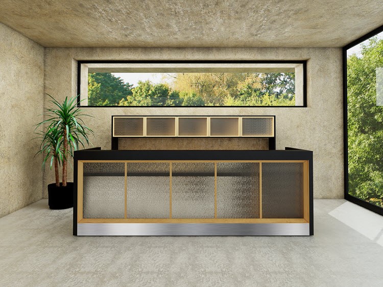
To make your reception area appear larger, organization is key—especially in the entryway, where first impressions are everything to your company. If you are working with a small reception area, opt for hideaway storage, a reception desk and credenza with closed storage, and use wardrobes or closets for coats and other winter apparel.
Employing Additional Light Sources
Light makes any space seem larger. Find ways to increase light without occupying space on the floor. Enhance standard overhead lighting with wall sconces. Hanging lights and table lamps will soften the feel of your reception area or conference room. Controlled lighting like this will make walls seem more obscure.
Workplace Flooring: Keep It Simple
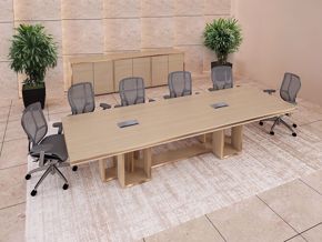
Let’s talk about what to do with the floor. It’s all about keeping it simple. Clean, easy, and sleek are all words that come to mind. When designing your floor, think simplicity. Here’s an easy option: choose area rugs that match the reception area floor, or that fit neatly under your conference table. Stay away from lots of small rugs—keep it clean, and opt for a larger one in their place.
Free and Secondhand Office Furniture
Who doesn’t like free stuff? Try cramming an extra-large conference table into a small room, together with a matching credenza. In case you haven’t thought about it, even though it’s free, it’s going to make your conference room extremely crowded and dull. It can be creative to use unique pieces in key places, but for the most part, furniture for your office should be appropriately scaled for space, walkways, and seating.
Special Pieces and Art
If you have an art collection that you would like your office to showcase, think about limiting your display. An eclectic group of frames may add visual clutter. It might be better to choose one or two pieces you really like, and avoid turning your office reception or conference room into an art gallery.
Office design is an essential component of any workplace atmosphere—and of visitor comfort and appreciation. Physically overcrowded areas of business can hinder performance and/or create gloomy feelings. Workplaces need to be functional, upbeat and inspiring. Even though workspace may be limited, finding creative ways to transform yours into a feel-good place to work is critical to the advancement of your business.

