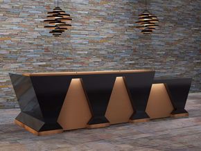
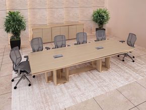
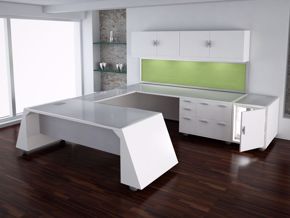
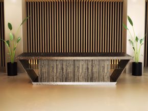
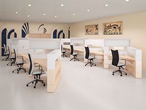
Do you have a perfect office workspace? Is it too perfect to work in or not perfect enough? One of the mysteries in life is why many people spend so much time working in their office and so little time making it workable. In most offices, many things can be done to make work more productive, visually appealing and better inform visitors.
There is a difference between a workplace and having a workable place to work. It becomes a “workplace” when having a place to sit (or stand) and perform a task is the only consideration. It becomes a workplace when there is a disregard for visual and functional elements that affect the productivity and the psyche. Disregarding what your office space needs to look and function well is a waste of time, dollars and joy. You can make your office space both functional, and a place your visitors and workers not only admire but enjoy coming to visit! Follow these simple guidelines to make your workplace, a dream working place.
- Visit, visit, visit. Collect images of your favorite reception areas, conference rooms and office workplaces from online and magazines. Don't worry about expense at the moment, just allow yourself to imagine! Colors, luxury furniture, luxury materials, wall panels and – whatever sparks your imagination. There are ways to create the same look for much, much less.
- Focal Points. Begin at the beginning, up front in your reception area. Decide on a layout for your space, one that creates the best point of interest visually, to grab the attention of your visitors at first glance. Also, give some thought to focal points, what your visitor will be looking at while seated. The focal point can be an architectural detail, a collection of company points of interest, big screen TV with helpful videos, or a work of art. Arrange the furniture around 1) the focal point and 2) experience you want your visitors to have.
- Get rid of clutter. Decide what relevant items to your visitor experience you want to in your reception area, or your workspace period, for that matter. To make your workspace look and feel its best, pare down on excess furnishings. Clutter takes away from the perceived space and attraction to the space overall.
- The wall is not the only place for furniture. Don't move all the furniture against the wall. Your workplace is not a Museum! This is a functional, workplace to entertain guests and get work done in an organized fashion. To learn more about furniture placement, visit The Basics of Furniture Arrangement
- Please be seated. Sit people in a reception area according to arrival groups. Avoid seating strangers in close contact with each other. Strive to seat people according to communication intentions. If the reception area is large and you have many visitor groups, divide your reception area into areas that seat various groups of people from 2 to 6. If it is a private office or conference room, separate seating according to the type of communication you envision.
- Defined areas of communication. Define conversation and seating arrangements by table and chair size, type and positioning. A small round conference table will invite small intimate meetings, as well as a small sofa and lounge type chairs in a private office. A small structured chair may indicate brief informal meetings. Area rugs can add visual definition to an office space, lobby or conference room and can be an accent as well. Learn more about area rug selection by reading Quick Decorating With Area Rugs
- The devil is in the details. Use architectural details, hanging panels, as well as furniture, to divide a reception or general workspace space. You can divide a workspace elegantly and efficiently with free-standing panels, fake columns, and various height floor distinctions.
- The color of window treatments. In general, window treatments look best in the color or dominant color of the largest piece of furniture. In a reception area, it could be a modern reception desk. In a conference room, it could be the conference table. This helps bring the room together and provide a background for the design.
- Look down but not out. Generally speaking, the floors in your workplace should be a little darker than the walls. This creates the foundation for your space design and delivers an attractive balance to the office.
- Use of angles. Laying out office furnishings on angles in the space can offer up a greater level of interest to your design as opposed to just a straight wall format.
- What to show off. Place pieces of interest in positions best seen from a seated position. Plan your company’s visuals on walls, tables, and counters opposite the seating arrangement so that your visitors can see it, not behind them, seldom noticed. You want to plan your design so that your business concept can be impactful
- Let there be light. Use several types of lighting in the space to add dimension and interest to the space as opposed to having a single one-dimensional light source. There can be lighting to read by, watch videos, emphasize and/or create drama and importance.
- Give life to the space. Bring the outside in to make the space feel real and natural. Add some live plants, rocks, flowers, open windows that look out on nature to give a feeling of nature in the workplace.
- Plan navigation. Plan walk space between seating and furniture and into and out of aisles. Use these suggestion to avoid having your reception area, conference room, and office workspace from having all the charm of a bus station or airport.
Using these few tips can help transform your workspace into a workable space that is appreciated by visitors and workers alike.

