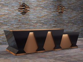
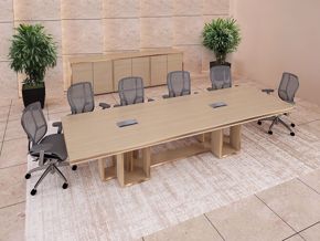
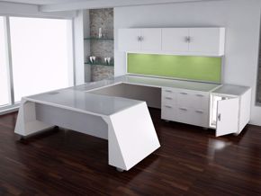
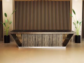
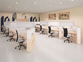
No one office space is exactly the same as any other, without the use changing from company to company. No one person’s design preferences can be exactly the same as everyone else’s, while also suiting every company’s individual branding needs. No one company’s process is exactly the same as the one next door, requiring the exact same configuration and tools as a completely difference business. It doesn’t matter if we’re talking about a modern reception area, a conference room, or an open workspace—however...
Let’s face it. When it comes to designing the perfect modern reception area—one that will work well in today’s contemporary workspaces—many people feel completely lost from the start.
That’s because there are so many things to think aboutbefore, during, and after the design stage of your modern reception area. When there are so many details going on upstairs—not to mention unanticipated complications—it can be challenging justto get started.
Where to Begin
Decide how you plan to use yourreception area, and then create from there. The wayyou want your space to function will influence yourdecisions when planning for your modern reception desk, supporting furniture, and layout. You can make the most of your modern reception workspace by following a few furniture guidelines and keeping the area appropriately outfitted. You can properly position artwork, company points of interest,and a few indoor/outdoor elements (like plants) to tie yourarea together.
Start with the Arrangement of Furniture
1. Design the function of your reception area.
Take some time to think about the primary function of yourreception space, together with second and third functions. For example, receiving visitors could be one function; client interaction could be another; marketing and business education could be a third;and accessing and sharing client/patient personal information could be a fourth. What is the function of the peoplewho will be working in this space, and what tools will they need in order to do their work? How many visitors will you be having in the space at any particular time? Will they be single visitors,or will they come in groups? What do you want them to see, hear, taste, and experience while they are there? The function of your reception area should serve as the main influence with regard to how you design your work and receiving spaces. With that in mind, here are a few tips for using your space:
- If your reception area has a natural focal point, such as a large window, unusual architecture,or anything interesting to look at, you might think about designing around it. Face the seating toward the focal point,giving all visitors seated in the area an equal vantage point.
- Some modern reception areas are large enough to divide into halves or thirds, creating separate groupings. If you have a big enough office reception space, you may want to consider creating an area for visitor activities, i.e., a private game room, coffee bar, or library. Consider placing a table, couch, or plants to create area separations.
2. Don’t block walkways.
Allow your guests enough space to enter your reception area and move around without being attacked by reception furniture or clutter. Visitors entering your workspace should have plenty of clearance, and not feel crowded.
- Don’t put office trees and other reception-area appointments at your front door. You don't want your visitors to have to wrestle past anything to come into your workplace. Obstructions are in direct contravention to “receiving.” Leaving open space around your entryway makes for a more welcoming experience.
3. Traffic Control
Arrange your furniture so that customers can maneuver through your reception area unobstructed. When designing your reception space, you have the power to create how and where your visitors will move through the area. Plan it carefully. It’sthe little details that can subconsciously add to—or detract from—a customer’s experience of your company.
- Notice where your entryways are in your reception space. If there is an entryway along one wall, try grouping your modern furniture in an area on the opposite wall.
- If your reception area has two doors across from each other, in many cases, this will allow you the opportunity to section the space into two distinct spaces, using the span between the doors as a divide.
- Working with more than two doorways, you can divide your space into several areas of seating and/or company points of interest.
4. Design to fit the size of your reception space.
If your reception space allotment is small, don’t attempt to squeeze all the furniture you can into it. Conversely, if you have a large reception area, you may be challenged with how to use the space appropriately.
- Think about your reception area’semphasis,and the amount of space you have to work with. Think about the number of visitors you will need seating for. Think about if they will require chairs or sofas, or possibly floating chairs. Flexibility can be an important design consideration, particularly in a small space.
- Whether your reception area is large or small, balance is the key to good design.
Lighting your Reception Area
5. Use lighting to add interest to your office reception area.
Using one light source in your reception area can make the entryway feel cold and look bland. By mixing a few layers of lighting from different sources, you can add interest and a bit of drama.
- You can employ a mixture of top-down lighting, lamps on tables, wall lighting, and floor lamps to create a more balanced look, feel, and function for your office reception space.
- Design your corner lighting for balance. If you have a lamp in one corner, use twomore in the room to balance the room’s lighting.
- Use tall lights to give the impression of a higher ceiling.
6. Try a dimming effect.
Dimmers can give you flexibility by providing a way to adjust the feeling the space conveys. If you have points of interest designed into your reception space, you can dim surrounding areas and highlight others with a brighter light source.
- Dimmer switches can lengthen bulb life and save energy, as well.
- Consult your electrician for advice about how and where to employ dimmer switches.
Designing your Modern Reception Desk
7. Make your modern reception desk fit the function of your area.
If you plan tohave more than one user, make sure you plan for at least 42" of workspace for each user. To make yourmodern reception desk more suitable for other job functions, such as filing and access to other job-related activities, plan for the supplies and tools you’ll need, and where they should be placed for quicker access.
- Certain areas of your modern reception desk can be devoted to lower barriers (where you wish to have more open communication with your customers) and higher barriers (where you wish to have greater privacy).
- You might want to design your modern reception desk withtask lighting under transaction-top areas to light darker areas.
- Cubbies under the transaction top might be a convenient place to keep forms or documents that need to be referred to often.
- Having your modern reception desk outfitted with a return can result ina great tool for workers who need more surface space.
- Making your modern reception desk fit the size designated by the design while suiting all job functions may involve some customization to keep your reception area thoroughly organized.
Believe it or not, your reception space is one of the most important areas in your workplace to design and plan for. That’s because it is the opening paragraph to your story, the first line in your presentation, and your first opportunity to give your visitors a taste of what is to follow.
Your reception area deserves your attention and planning. If you need help creating a plan for your reception area, the design assistants at 90 Degree Office Concepts can help.

