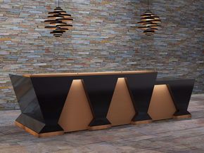
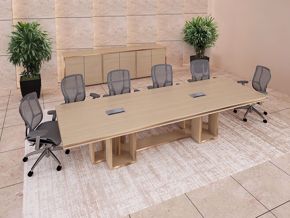
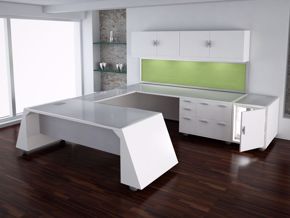
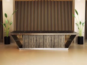
Chances are, if you had to choose only one area in your office workplace to really get serious about design—and categorically put your efforts into being creative—your reception area would most likely be at the top of the list. It’s the idea of thatone impressive image that can definitively setvisitor expectations of your entire company that gets most people’s design juices flowing.
Office Reception Design: First Things First
If designing your office reception area is on the top of your list,too,I would suspect finding the perfect modern reception desk would be the first thing you are doing. If that’s true, I can only imagine you’ve been searching around the Internet looking for that special desk. You know the one I mean…the one you have in your mind that you just can’t put your finger on until you see it.
Office Reception Design: Getting It Right Can Be Challenging
You may be amazing at what you do, but when it comes to knowing exactly how to design your reception area,what it needs, how it’s going to look, and which designs to employ to bring it together just right, you could find yourself challenged. Don’t be alarmed! Choosing the right reception desk for your business is not easy. Many professionals struggle with these same questions. Creating the best look, feel, and function for your reception areaoften requires help.
Many people get stuck just getting started, because there are so many things to consider,and it gets totally confusing. Although some things are obvious, others are not—things you may not have thought about with just a spotlight and a road map at your disposal—because you just don’t know what you don’t know. Armed with uncertainty, the journey begins: searching for the perfect modern reception desk with the idea of “knowing it when you see it.” Does that sound familiar?
Office Reception Design: Online Searches Can Be Challenging
Taking the next step forward in your search, you’ll find it stated time and time again how important it is to make a favorable first impression, and how crucial it is to show up looking good to your visitors. The problem is, they don’t tell you how to accomplish this, or how to make it happen. If you’re challenged in the first place, how are you supposed to get answers?
This article is certainly not going to be a lesson in design. Rather, it will offer a few important things you need to know about buying your reception furniture and choosing the design style best-suited to your business.
Forget about What You Like
Forget about shopping online for a reception desk you like. By that, I don’t mean you should disregard completely the style that appeals to you. You should remember that you are running a business, and the idea of design, first and foremost, should be to support the ideas and purpose of that business. To do that, you must have a clear understanding of who you are, and how what you offer fits the mindset of your audience. If you are technical and detailed, be that. If you are slick and fashion-forward, be that. If you are warm, natural, and earthy, your design style and message must be harmonious. You are selling your business products, ideas, and services, not putting on a personal display.
If you are Nike, a workplace design that presents as cozy, warm, and comfortable is just wrong. If you model Whole Foods, having a reception area that presents as slick and edgy would work in direct contravention to your message. Google, a company many people admire for its sense of office design, shows up as colorful, fun, young, and creative. Designing your modern reception area for the business rather than the person will aid in forming your business’s mental presence.
Office Reception Design: Designing for Your Audience First
Secondly, you must understand the audience your business will be entertaining. Your reception area design should be directed toward the preferences, habits, and services your customers believe you can fulfill for them. Customers should be entertained, and experience your company in a manner that best represents what you are for them when they are visiting your workplace.
Office Reception: Designs That Make Sense
Any human entering a building or space enclosure is guided by their senses. What they feel, hear, see, smell, and taste will stimulate their imagination and desires. As a reception-area designer, it’s your job to activate and guide those senses in a way that promotes the value of what you have to offer them. If what they think you have to offer differs from what they actually want, your job just got harder.
Here’s a question for you: if you are going for feeling with your reception area design, what features can you come up with that might guide those feelings? This is where creativity can provide direction for you. Think about all the things in life that might impact your feelings: the smell of home-baked bread might make you hungry, or remind you of past times. The sound of a love song may make you feel romantic; the color of a room could be somber or exciting. The sight of gold could generate feelings of expense or luxury. Creatively, relating things to feelings can help to shape the way your visitors feel when they enter your workspace.
Designing Your Reception Area: Choosing the Style That is Best for Your Business
Regardless of your preferred reception-area style, there could be one style that works better for your company than another—just like the clothes you wear.
Unlike the choice of clothing you select, however, your company style affects more than one person. Often, when you are first getting started with your business, you wear what you can afford. As you grow and come into your own, you come to greater and greater realizations of which style works best. A business design profile works in similar ways. But how can you know which style works best for your reception area? You will find below several styles that can be used effectively in today’s modern world.
Modern, Contemporary, and Minimalist: Three Reception-Area Design Styles with a Common Idea
These three styles are often referred to under same umbrella as modern reception-area design. Notwithstanding the differences, these styles have a lot in common. Though I’ve heard it said that these styles can appear cold and uncomfortable, if put to work creatively, they can be extremely comfortable, and make your business look unique while allowing your reception area to appear larger. Here are the distinctions between the styles…
Modern Reception Area
Modern interior design got started with the Bauhaus Movement, a school that came into being in Germany around 1919. The main idea was to integrate materials, clean lines, and neutral colors with black and white to create a primary theme. The main idea behind this design style was “form follows function.”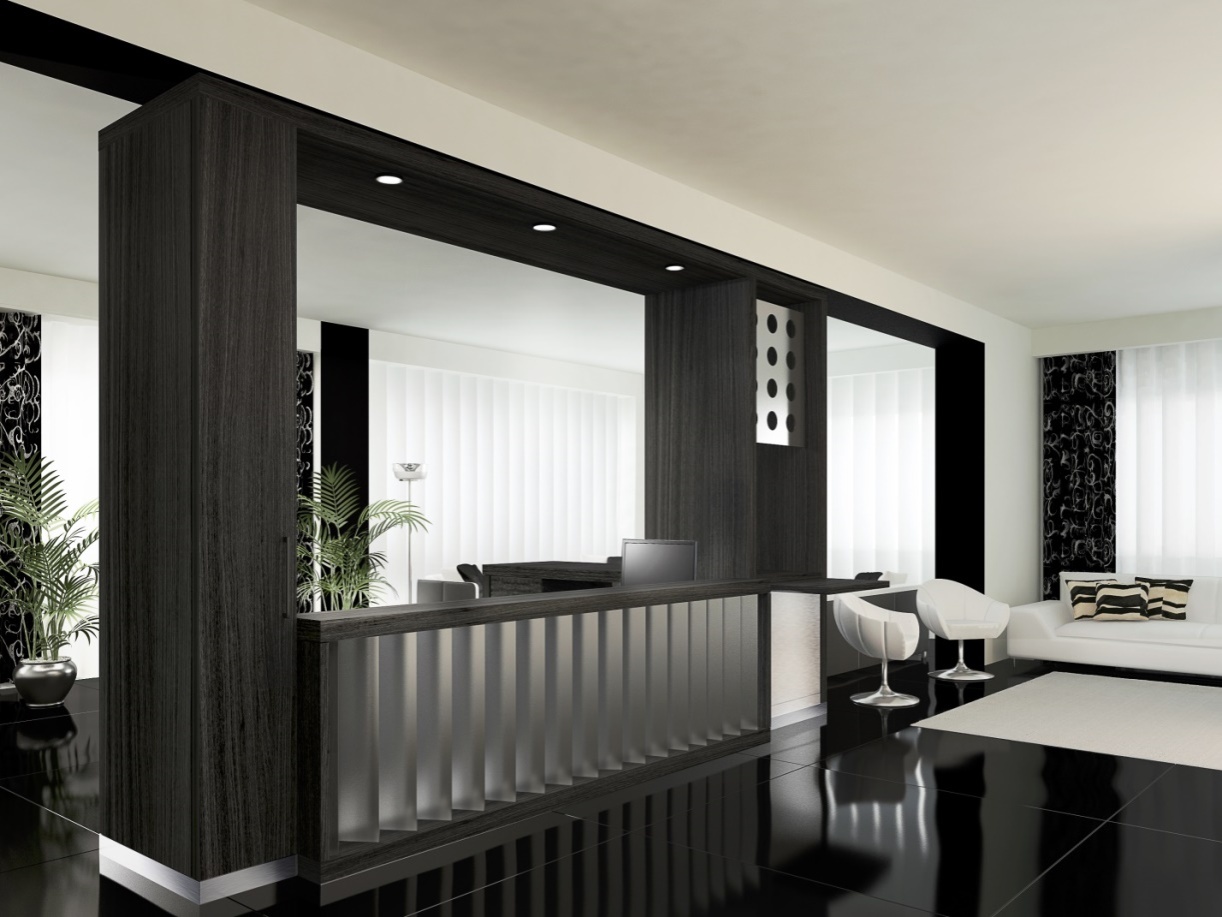
Greenwich Modern Reception
Contemporary Reception Area
Contemporary reception-area design embraces geometric shapes, clean lines, and practically nothing ornate. The main focus, in contemporary style, is space within your reception area. Fabrics are often solid, and include neutral colors alongside office-reception furniture in strong colors.
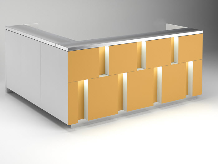
Colorado Contemporary Reception Desk
Minimalist
Minimalist reception-area design employs natural light to accentuate spaces and shapes. Cool colors and white-and-blue lighting are principal elements in this reception-area design style. Because the minimalist style places emphasis upon the bare minimum of furniture, hidden or reduced storage of items that can be tucked away brings attention to practicality. Minimalist reception deskswill have cabinets that blend into the furniture, as well as walls to close off from view all functional use.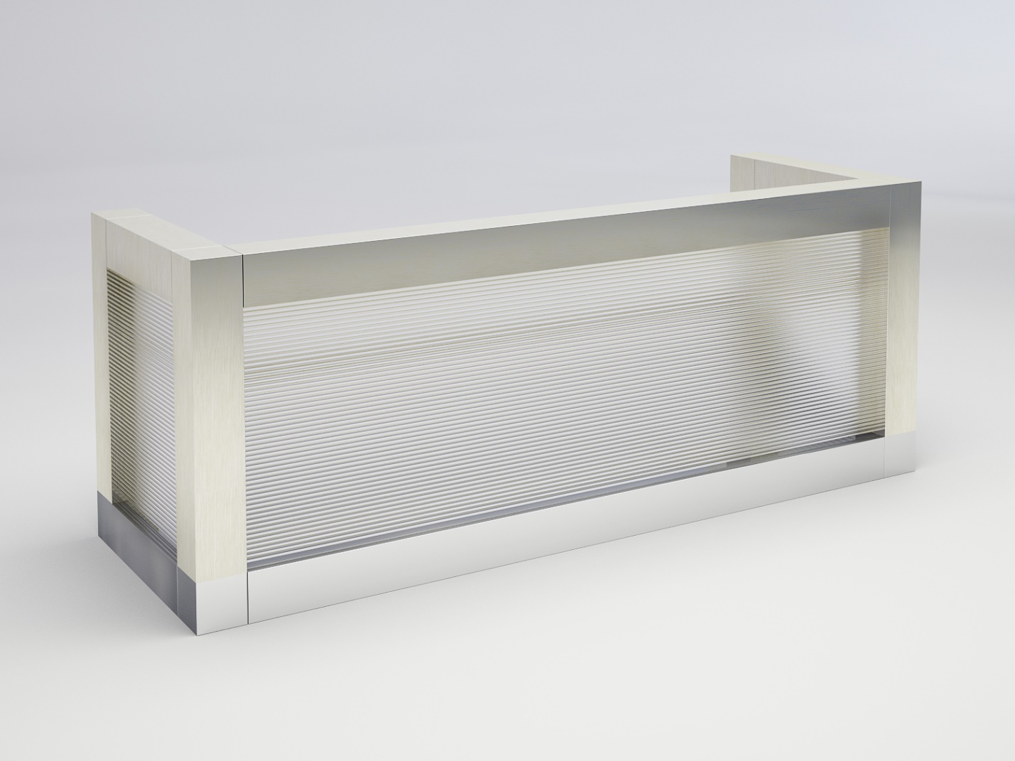
Los Angeles Reception Desk
Eclectic Reception-Area Design Style
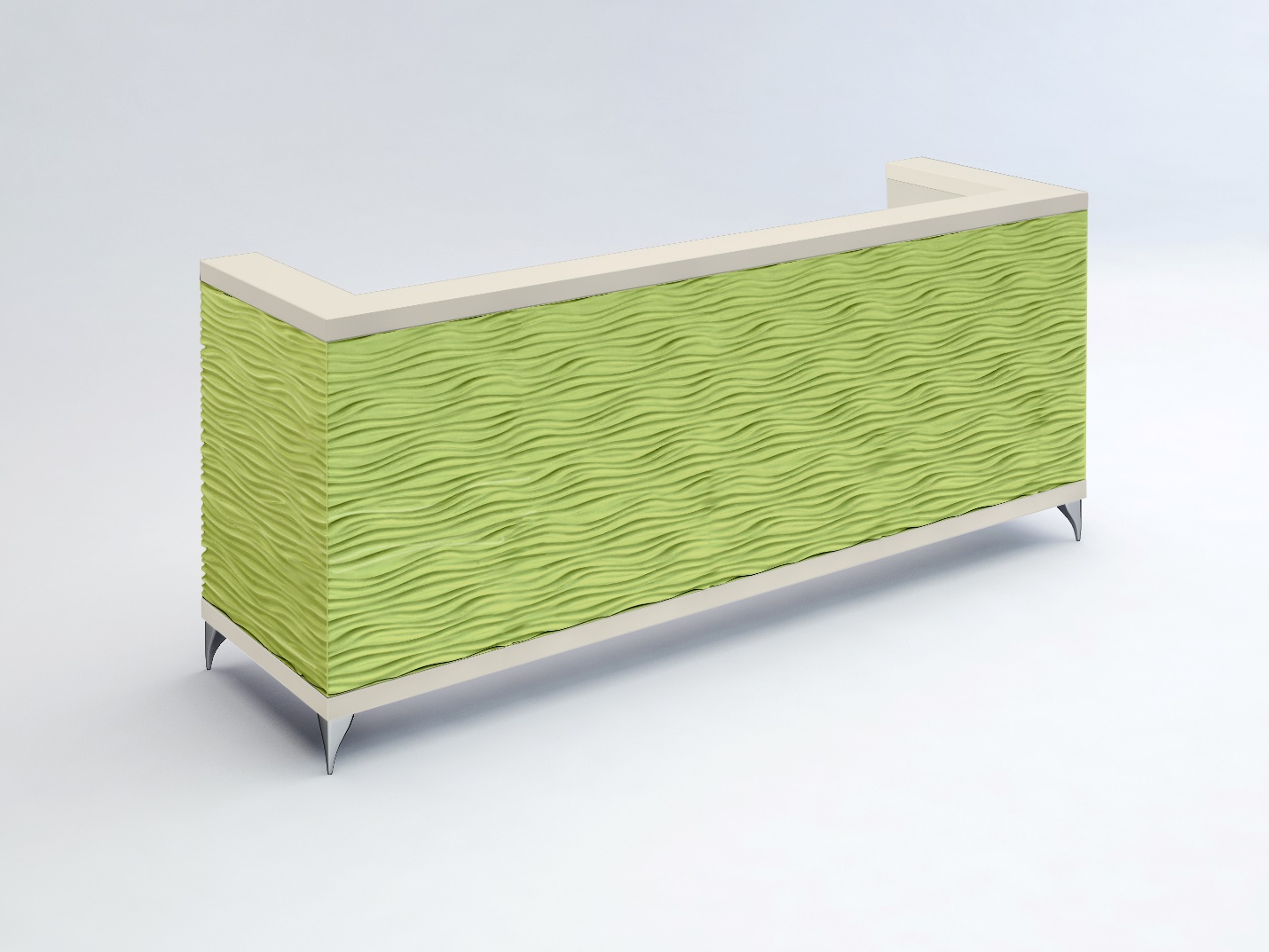
This office reception-area design style is not so much focused upon avoidance of using space, but rather upon turning attention to the furniture by employing unusual fabrics, materials, and colors. This approach devises looks and designs that are radically different from one another, while at the same time appropriate for the company and the space they occupy.
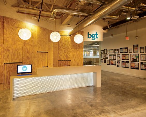
BGT Reception-Area Design
Office Reception Area: American Arts
A reception-area design style indigenous to America’s northwest brings to mind basic practicality and sensible design presentation. Even though this reception-area design style is minimal in detail, it come across as separate from other styles through the use of wood and simplicity as primary design elements. Furniture and other design elements, though under the modern umbrella, feature a combination of exposed wood and simple fixtures. Architecturally speaking, wood-layered walls and traditionally-styled ceilings are a common design feature of an American Arts office reception area. 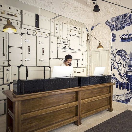
Office Reception Area: Classically Modern
Classically Modern
Classically Modern reception-area design brings attention to symmetry—and reception areas that feature a central focal point. A care fully-chosen reception desk, seating arrangement, or fireplace is often used in this style of reception entryway. The use of color often takes natural elements into consideration, but it can be embellished by colorful finish overtones. Colors are often soft hues: earth tones, blues, yellows, grays, and pinks.Fabrics are elegant without being overpowering. Cotton, linen, and velvet representsome primary examples. Reception furniture should be comfortable while still possessing style. The incorporation of columns evocative of classical Greek and Roman periods can fit in well with this style. Adding a twist (such as color) to a classic piece can give this style a little zip.
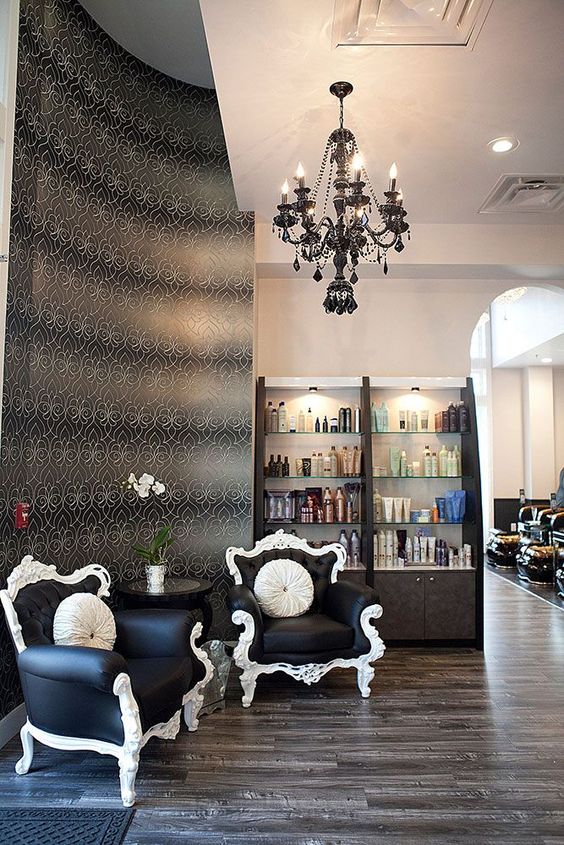
Reception Area: Classically Modern
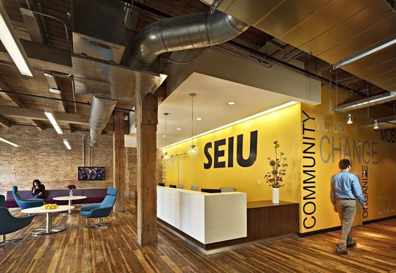
Reception Area: Industrial Design Style
Office Reception Style Gone Industrial
The industrial look is an urban style that has recently come to the office workplace—and it brings with it a modern flair. This recent office design movement has increased with the renovation of spaces previously used as factories in downtown areas like New York, San Francisco, Seattle, and Chicago. This office design style caters to materials that have an industrial feel, i.e., iron, steel, planked wooden or concrete floors, and open-ceiling beam and wall columns. Office reception furniture favors reclaimed woods, metal bands, and leather. This office-design style accentuates space.
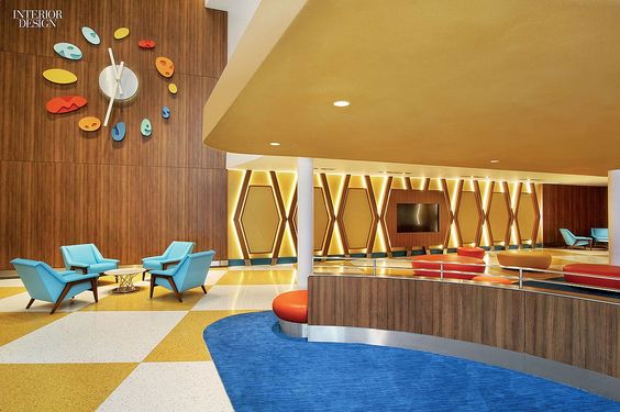
Universal’s Cabana Bay Resort: Retro Reception
Reception Area: Retro Design Style
Retro design style gets its look from past design styles with a modern twist. From there, we can extrapolate to Art Deco and other design eras. We can also take design styles from the more recent past,building an updated look with the addition of bold colors or a change of materials.When this style is well-executed, you get the feel of a vintage environment—but with a dash of modern.
The office-reception design styles listed above have beenpresented just to offer up a few ideas that could possibly work for your company. It’s up to you to choose one—or to mix and match elements so as to create your own style that you feel will best reflect your company’s purpose.
Need questions answered about your office-design style? Need ideas for your reception area? Visit 90 Degree Office Concepts, or give us a call.
![]()

