If you’re considering designing a new, or redesigning an existing office space and are wondering how to create a space that will improve your business functionally, financially, and make a startling impression on visitors and workers alike, it's a good idea to start with your reception area.
Serving as your company's “window to the soul,” this area is generally the place that draws in the majority of your office’s visiting traffic. And despite its distinction, many companies struggle to design it properly.
You see, your reception area needs to wear different hats and use them interchangeably. Rather than treating it like some out-and-out landing spot constructed around one specific purpose, it should be designed to function in many different ways and attend to many audiences, with different perspectives. In order to do so excellently, it needs to be designed with purpose. To say it another way, you will need to integrate essential elements that are attractive, provide an education to visitors, and invite interest and communication.
In order to increase visitor interest and interaction from the moment they enter your workplace, check out the following key ideas that describe essential design elements every office reception area must have.
View a collection of compelling reception area designs that speak to various business themes.
8 Essential Design Elements Every Office Reception Area Must Have
You want to optimize your reception area for visitor communication

What You Should Include in Your Reception Area’s Design
1) A theme
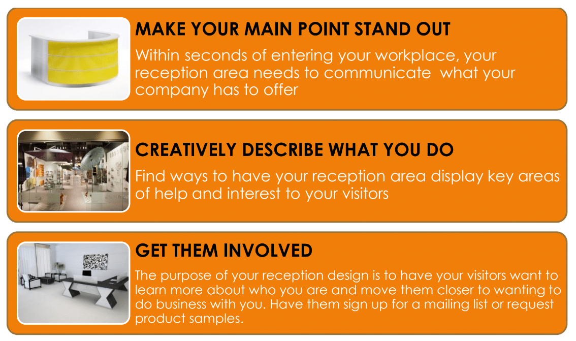
It should not take more than a few seconds for a visitor walking into your office reception area to know what you do and what you have to offer. That's the purpose of a design theme. It could be as simple as a few bold words on a wall to add to the look and feel of your entire reception space.
Here’s an example; walking down the street on Miami’s South Beach after an auto show, I came across a restaurant which featured a chef making fresh pasta in the front window. Upon entering the establishment, there was a hand painted sign on the wall that read “Eating is a necessity, eating well is an art.” The visual, together with the message, left no doubt what this business had to offer…fresh Italian food, artfully prepared…simple, yet effective!
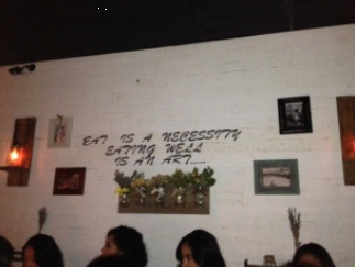
I am sure there are many types of visitors that may find their way into your workplace, and you'll never be able to create a theme that will hit the ball out of the park for every single person. Instead, creating a theme for your reception area is pretty much like writing a great headline for a blog article or your webpage as the folks at KISSmetrics recommend. Write your headline (or design a theme) to target the 20–35% of those people that are most likely to be happy with your product.
Keep your reception design theme clear and noncomplex, like a simple and effective headline. Notice how Apple uses a simple and effective headline theme for the iPhone…it’s a very cool example: “the only thing that changed is everything.” Likewise, a modern reception area’s theme can be extremely simple, while being extremely powerful. The key point Apple drives home is “change”. That’s what Apple is about-innovation.
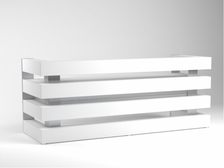
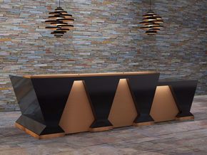
INNOVATIVE SIMPLICITY THEME APPOINTMENT
The Athens Modern Reception Desk
2) Theme description
Your sub-theme should supplement the primary design theme by reflecting brief descriptions of what you have to offer. You can address this efficiently by directing their attention to areas of what you do (product or service) that solves their biggest problem areas.
To optimize your design theme, use size or color in contrast with other lesser important areas of interest. This will enhance visitor experience and visually drive your point home. Small displays can get lost among other areas of visibility in your entryway. If by example; a modern reception desk communicates that your company is forward-thinking and innovative, fill that designated space with design detail that is very modern, and/or use color to make it stand out.
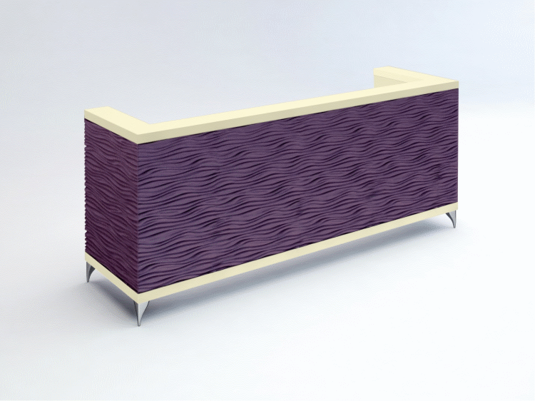
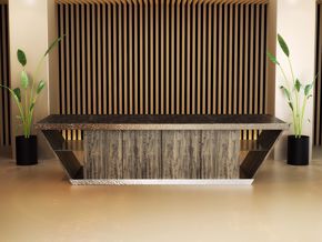
New Orleans Contemporary Reception Desk
This is an example of how reception furniture can define a theme: The product design says your company is non-conventional. The color suggests the company is bold, powerful, ambitious and creative. Check out an article by Bourn Creative; The Meaning of the Color Purple. This kind of statement tells visitors you are not fly by night, that you can provide creative solutions, and that you are motivated.
3) Get them involved
The main purpose of getting visitors to your workplace is to encourage them to get involved with your company in some way. It doesn’t matter if it is a customer, vendor or a new hire, the goal is the same. You want involvement. Provide two to three actions they can take to get deeper involved with your company. Strategically place them throughout your reception area so as to make them easy to find.
Your involvement ideas should be visually outstanding, preferably in a color that contrasts, while fitting in with the global reception area design theme. Your choice of words should be simple and to-the-point -- no more than five words -- and action-related, the point here is to get your visitors to take some kind of action while they are there. Here are a few involvement statement ideas to get visitors more involved with your company: "Make an appointment for," "Try this for free, “Watch this video on, or "Sign up for."
Try positioning these involvement opt-in’s in your reception so as to make sure they’re easily found and compelling. If your idea needs computer access, provide a computer station. If it’s signup, provide signup tools, etc. Think about adding a clearly separate area for each of these offers so as not to get confusing.
Pinterest often has images of unique reception area organization tools. All ideas may not work for your type of business. Think things through and adapt the ideas that work best for your business.
I marveled at some of the opt-in ideas that auto manufacturers and product suppliers came up with at the auto show; design your own auto wrap, mix and match paint and interior swatches, virtual reality track driving, survey contests, test drives etc.
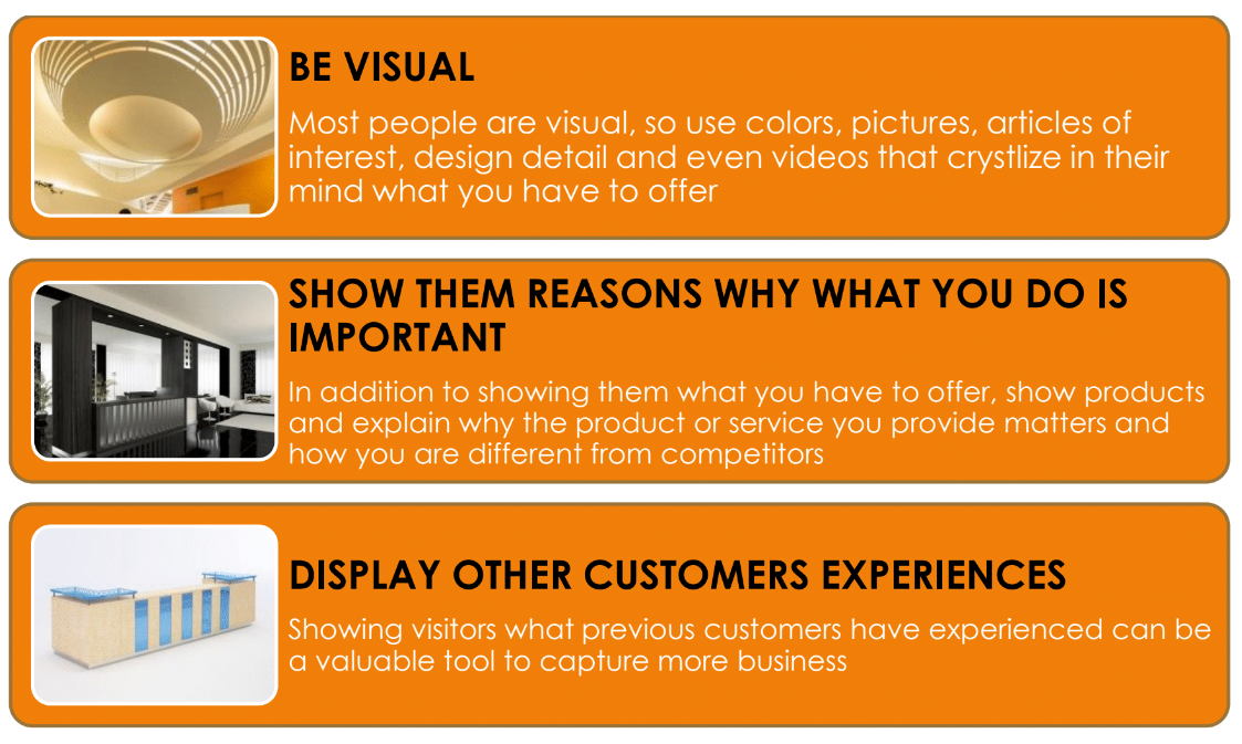
4) Be Visual
Most people respond better and faster with visual aids http://primeinfographics.com/65-of-all-people-are-visual-learners/. Try using an image or two in your reception area (or even a short video) that clearly indicates who you are and what you offer http://www.forbes.com/sites/nickmorgan/2012/07/23/are-you-a-visual-learner-really/ . Use images that capture emotion and cause action, and avoid cheesy stock photos. (Here's a list of 17 great places to find free stock photos online.)

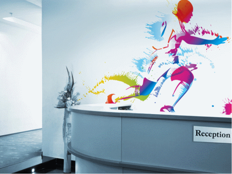
Limitless Walls is a great source for expressive imagery: It offers unique wall images of many categories that capture emotions.
5) Show why what you do is important
What you offer may be important, but the sound reasoning behind what you do is just as important. People need to know what the benefits are that come with purchasing your products and services. That's what will coerce them to hang out for a while or dig deeper.
If you want to display reading material about what and why you do what you do, make it easy to read, and forgo the jargon, write in a manner your visitors will understand.
6) Social Proof
Social proof is a powerful indicator of trust, check out testimonials. Your product or service could be on the top of the charts, and if you toot your own horn, some people may not believe what you say until other people say the same about you. And that's precisely what social proof does, provide a belief mechanism.
Provide a scrapbook of letters, quotes, case studies that demonstrate the value you offer. Include an individual or company name to quotes and photos is a way to add credibility to a testimony.
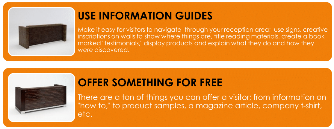
7) Planned Navigation
Your workplace reception area’s planned navigation design and content could make the difference if your guests come away with anything more than they came with or not. In order to increase company value, provide your visitors with a clear path into the workings and benefits of your company without making them work to find it. Plan reception area navigational tools that are visible with each element of your design, or create a menu to offer to guests as they arrive. Organize the elements of potential interest in a hierarchical order of importance.
No one knows your company better than those who helped create it, so be sure to make it uncomplicated and instinctive for those visiting to find information about your company that will be useful to them.
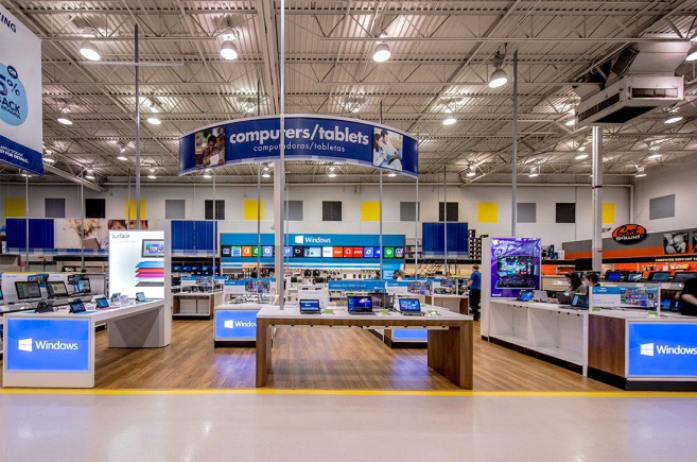
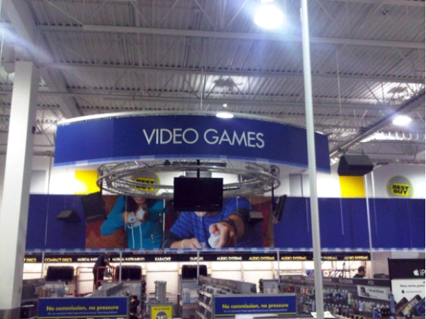
On possibly a much larger scale, notice how Best Buy makes navigation through their stores easy.
8) Content Offer
To create a visitor relationship right from your office reception space, feature a really great product or service offer such as a free product sample, information guide, test drive, “how to” whitepaper, ebook, or a DVD. Visitors that come into your business may not be prepared to do business today and might find it helpful to have information they can review at their leisure. If you want some ideas to use online and off, here are 23 different content types to pick from.
Does your business reception area have all or most of these elements? Are there any we missed? Share with us in the comments.

