


 No matter how you like to communicate; send an email, write a letter, speak your words, send a text, or even sign a phrase, there is always one common purpose, to get your message from here to there. When you think of all the possible ways to get your message across, there’s still more… Aside from all the common ways that everybody thinks of, there’s a host of non-verbal ones as well; a smile may be engaging and a grimace may show discontent. Expert’s estimate 93% of all communication isn’t coming out of your mouth. These fundamental truths are just as real with body language as it is shown by inanimate objects in your office.
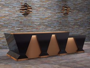
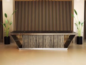
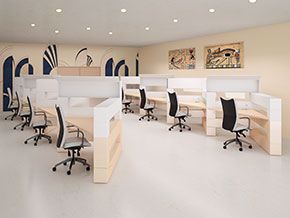
Your office’s reception area provides nonverbal Q’s to your customers, vendors, potential new hires, and associates without you saying a word. One of the most communicative facets in reception area design is use of color. Color can be used to create focal points, group vital ideas, show meaning, and enrich aesthetics. Color can make main points stand out, and reinforce your organization’s primary message. On the other hand, using color incorrectly can degrade your entire message.
Sometimes companies seem to be afraid of color particularly in critical places like reception areas. Perhaps it stems from decades of indoctrination that says “professional” and style conservation belong in the same sentence, so to speak. From another perspective, some companies may be flagrant with color and take it to the opposite extreme. Although the conservative approach may appear more relaxed, reality may be that both groups lack a clear understanding of the dynamics of color. Thoughtful consideration of a few unassuming directions can make your reception furniture sizzle in an environment that is the envy of all observers.
Less is more
When the eye becomes overwhelmed with too many colors, the brain goes into overload. Limit the amount of colors to three and five, max – an amount the eye can engage with at one glance. You want to use your reception area to deliver a message, so choose other avenues of style (like a reception station) as well rather than using color as your only method of design communication.
Choosing reception color wisely
You can establish great color mixtures for your office simply by using directional combinations in the color wheel. Using adjacent colors on the color wheel is called analogous, whereas the use of opposing colors on the color wheel is called complementary. Colors at the corners of a symmetrical polygon circumscribed in the color wheel (triadic and quadratic), or colors found in nature achieve great working combinations. Use warmer colors for foreground elements and cooler colors for background elements. If you want to insert a more safe color into your grouping (one that does not compete with other colors) then use a light tone of gray.
To Saturate or Not to Saturate
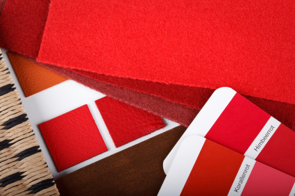
Pure hues are found in saturated colors. Use these colors when you want to invite thought in a certain direction. It’s natural for the eye to move subconsciously to bold, dominate, saturated color, whereas unsaturated colors are more visually inert. These colors are great to use when the lead priority in you lobby area is centred on performance and efficiency. All things being equal, the general acuity is that bright unsaturated colors are perceived as friendly and professional while dark unsaturated colors are alleged as serious and professional. Saturated colors are recognised for their excitement and dynamics. When selecting colors for your reception or lobby area, be mindful when using an excess of saturated colors because they can increase eye fatigue basically because the eye is naturally drawn in that direction. Saturation refers to the amount of gray added to a hue. As color saturation increases, the amount of grey decreases.
- Brightness refers to the amount of white added to a hue. As brightness increases, the amount of white increases as well.
- Analogous colors are colors right next to each other on the wheel
- Triadic colors are colors used in triangular corners of the wheel.
- Complimentary colors use colors directly across from each other on the wheel.
- Quadratic color use colors that are in four corners of a square
If your company’s culture exists around a modern, more contemporary furniture profile a selected grouping of relevant colors can aid in creating a meaningful presence in your office. Conversely, if the culture lends itself to a more transitional scheme using color can aid in creating more visual complexity. Whatever your message is, you can use color to say it better. To help you do that…
Color Glossory
Here is a brief glossary of color meanings you can use to outfit your reception area:
- Bright red: exciting, sexy, energizing, hot dynamic
- Brick red: earthy, warm, sturdy, country
- Deep red: rich, elegant, refined, expensive
- Peach: nurturing, delicious, comfort
- Tangerine: vital, energizing
- Terra Cotta: earthy, warm, welcoming
- Light Yellow: happy, sunny, pleasing
- Bright Yellow: friendly, energetic, innovative
- Tan: rugged, rustic
- Earth Brown: grounded, steady, durable
- Light blue: calm, peaceful, clean
- Deep blue: credible, authoritative, strong, loyal
- Foliage Greens: healthy, restful, growth
- Turquoise: compassionate, protective, faithful
- Blue purples: meditative, spiritual, intuitive
- Deep purple: visionary, royal, prestigious
- Neutral grey: classic, practical, logical modest
- Beige-off white: comforting, smooth, subtle
- Silver: sleek, classy, modern, stylish
When selecting the colour of your reception area, it is important to focus on the biggest picture of communication first. Understand the biggest message you want to communicate first, and then build your environment around that theme.
For more information on how you can use color in your office design, contact us at 855-699-0334 http://90degreeofficefurniture.com/contactus